Steirereck is one of the best restaurants in the world. The need for more internal space and the growing demands placed on this sector necessitated a comprehensive re-formulation became necessary, despite renovations being completed only a few years before.
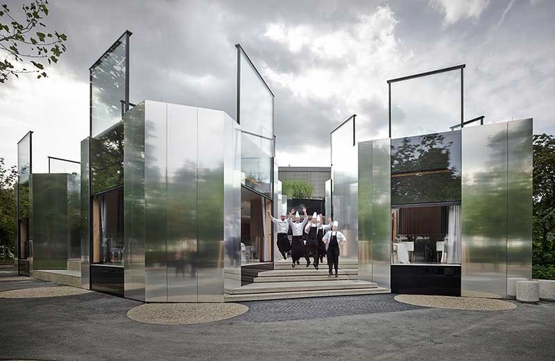
▲ Entrance

▲ Relation Between Inside And Outside
The architects studied the restaurant industry from the perspectives of employees and clients, and found that , in comparison to the living space, the historical development of the restaurant is less differentiated, usually a large dining room filled with various decorations. The architects aimed to create a new dining area. As a result, the restaurant branches out like a finger, reaching out in different directions and seamlessly connecting with the park’s environment, including the nearby children’s playground.

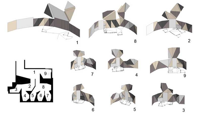
▲ Site Plan
In order to develop a closer understanding of the task at hand, we completed in depth research into the topic of food from both the perspective of catering staff and customers by slipping into various different roles. We saw that, in comparison to other typologies such as that of housing, the historical development of the dining space has been less differentiated. The classical dining space is essentially a container which is then filled with tables. Our suggestion provides the missing link. When designing the new dining space we worked outwards from individual tables. What used to be a terrace leading to a children’s playground is now a system of pavilions, branching out, finger-like, from a precise table arrangement. Every table is placed at the edge against the façade and offers varied visual connections to both the outside and to the other tables.
The pavilions are constructed out of individual components made of industrial wood, providing the tables with a protective backing, a home for the evening.

▲ View Park
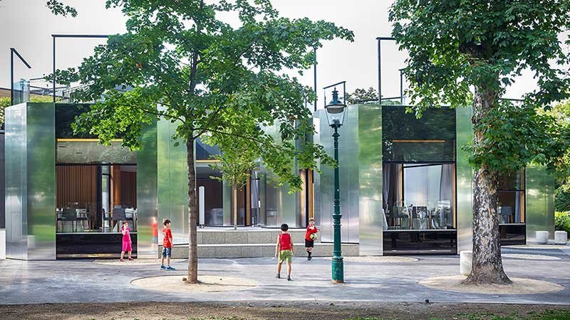
▲ Interaction With The Park
The exterior of the restaurant consisting of large electric sliding windows and slightly reflective metal panels that appear to be fogged, has good indicators of acoustic and thermal comfort, creating an unusual but inviting image. The guests eat in the restaurant as if they were outside. The terrace of the restaurant is directly connected to the park. The large electric sliding window is lifted up and becomes a feature of the architectural shape. There is also a herb garden on the roof.
The restaurant is like a gentle luminous body.
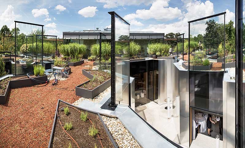
▲ The Roof Herb Garden, The Large Electric Sliding Window Is Lifted Up, Becoming A Feature Of The Architectural Modeling.
The proximity to the park was of particular importance to the clients. Large electric sash windows, and the slightly reflective metal façade that appears to be coated with dew, create a sense of visual closeness, providing guests with the highest levels of acoustic and thermal comfort while at the same time giving them the feeling that they are sitting outside and yet also at home. The pavilions lead to courtyards on the same level, which are connected to the park via seating steps that signalise both embeddedness and, at the same time, a borderline. One of the gullies leads to the entrance, and the herb garden can be found on the roof.
The mimicry architecture of the pavilions creates a connection to the light architecture often found in parks.
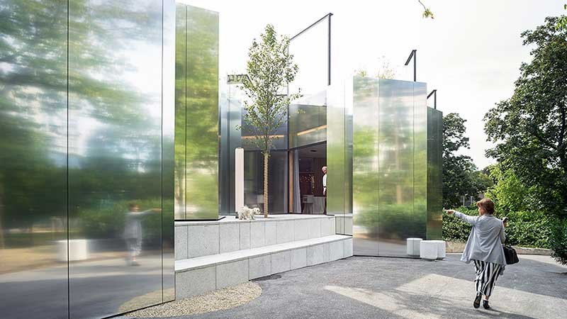
▲ Interaction With The Park
The existing listed dining space on the side of Wiental will undergo a complete change. Curved, partially rotatable metal panels bring the material of the pavilions’ façades into the interior space, creating rooms of different proportions and sizes when needed. The ceiling floats above the heads of guests like a horizontal contour map, with the mountains and valleys making the window lintels disappear, effortlessly negotiating the different positions and heights of the rotating elements. Where the listed nature of the structure allows, frameless, contorted elements made entirely of glass, they will be inserted. The combination of new and existing elements allows the room to appear simultaneously old and new.

▲ Old Remodeled Dining Hall
A middle section connects the different areas and levels and will be crossed by staff and guests alike. The algorithmic tile pattern, which is at no point identical, reminds the viewer of a kitchen, giving the guest the sense that they too are involved in the inner workings of the restaurant. Marking the way are cabinets used by the kitchen staff containing interesting objects, which, together with the seating provided at intervals, encourage guests to stop and spend time there. Passing seed and cheese cabinets, the basement route leads to the toilets, where a whole new world is revealed. The crystalline shape stems from the positioning of the toilet pans and washbasins and is visually perplexing by contradicting, geometrical paintings.
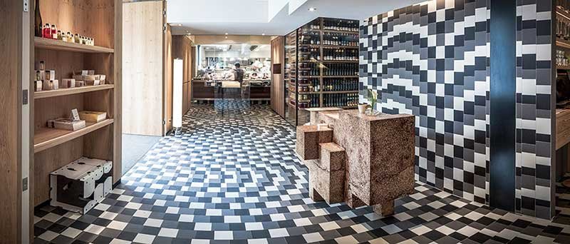
▲ View Into Reception And Kitchen
Under the pavilions, there is a generous kitchen extension housing sinks, a pot and pan cleaning area, a food preparation area, a patisserie, washing facilities, a laboratory kitchen, and a social room all of which are light despite their location and partially lit by lights in the daytime. At the lower levels, there are also extensive new areas for building services.
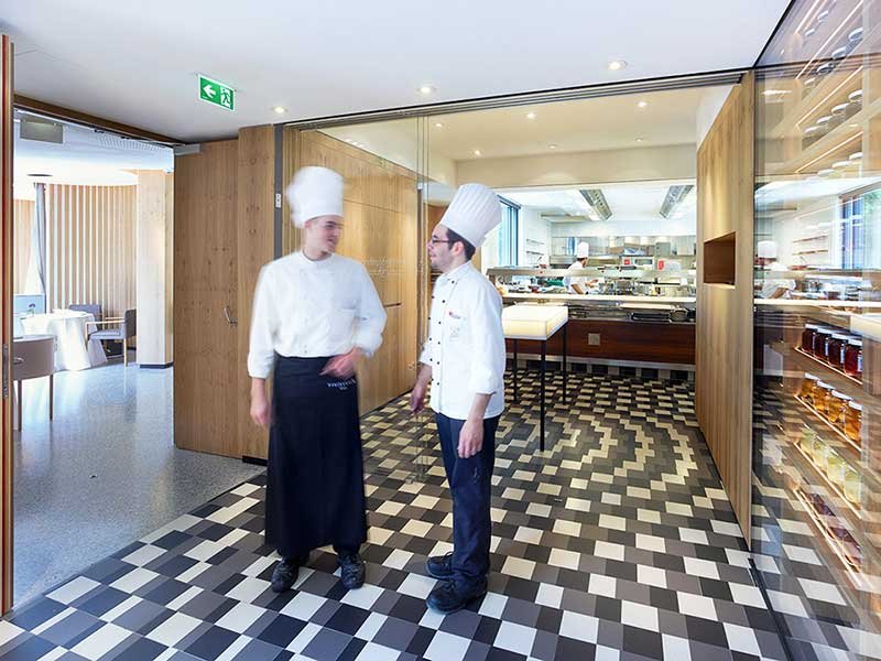
▲ Hall
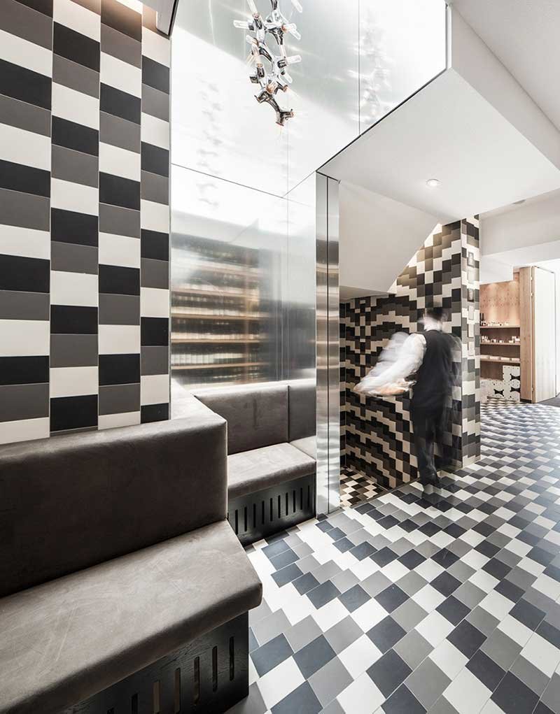
▲ Hallway
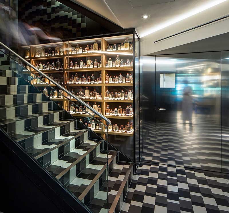
▲ Access To Lower Level And Seed Display
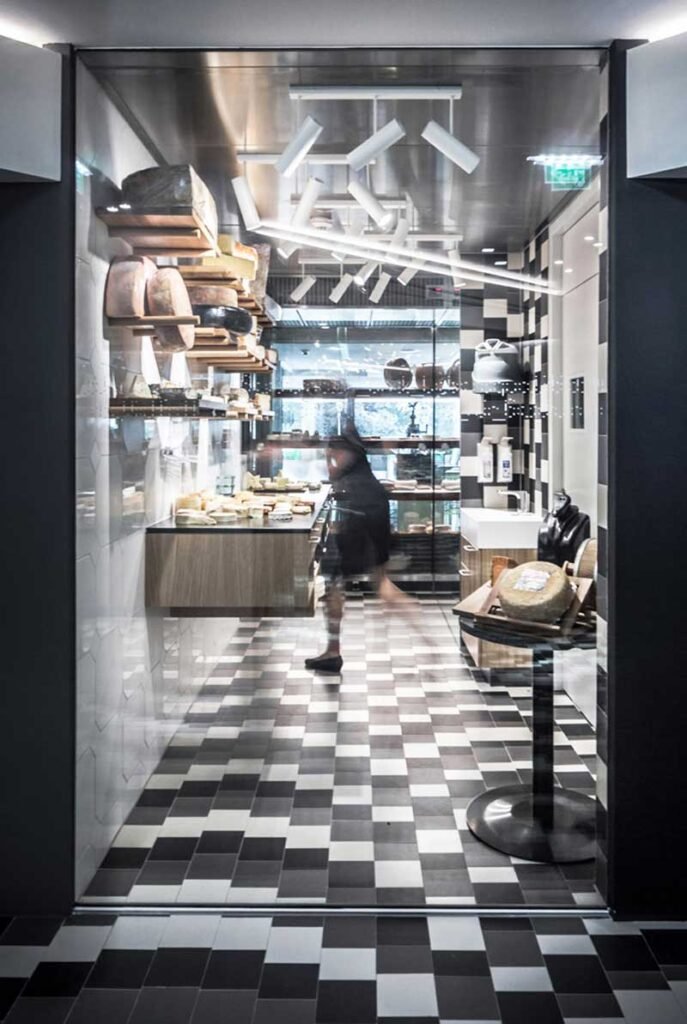
▲ Cheese-Display
The bathroom in the middle of the restaurant continues the atmosphere with Mosaic tiles and a unique crystal-shaped pattern for the wall decoration. The bathroom is an important part of the restaurant.
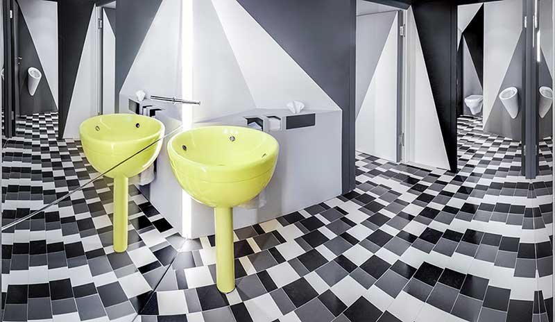
▲ Mens Toilet
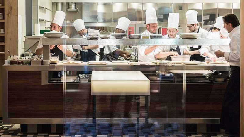
▲ Open Kitchen
All aspects have been discussed in great detail, the numerous suggestions bringing us ever closer to the appropriate solution. Many experimental elements were created throughout the process, in terms of both construction and cabinetry: The tables and stove in the smoking area with its chambers of different temperatures visible through glass bubbles, the large reception desk in the entrance area created from a special mixture of wood and synthetic material, the handbag bench that can also form a screen if needed, etc. In these elements, we have attempted to combine natural and high-tech materials as well as new and existing furniture. At various points, images of the 2004 renovations can also be seen.
Within a planning and build time of only two years, a project has been realised that combines many very different areas with an extension to create an entirely new building. A large part of the construction work took place while the restaurant was still open for business, creating additional challenges for all involved. During the construction period the building was accessed from above, giving guests with a view of the building site. The construction fence erected specifically for this area was a building in itself.
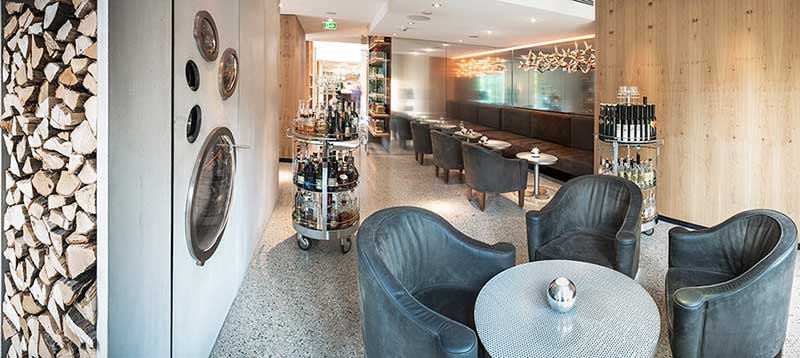
▲ Lounge
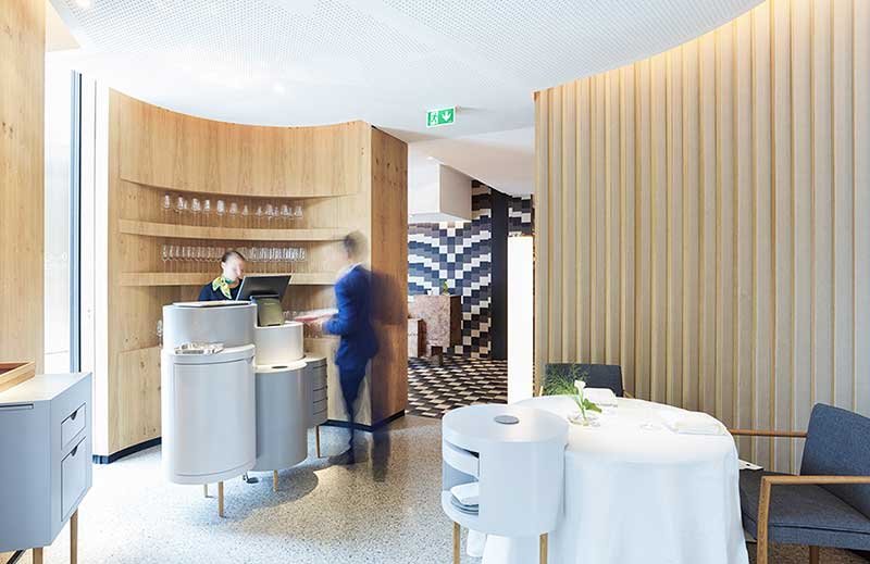
▲ In Between Pavilion And Hall
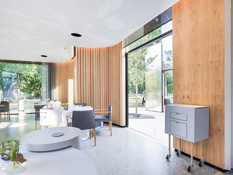
▲ Connection Inside And Outside
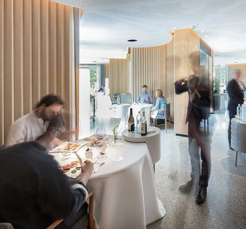
▲ New Dining Area
A new restaurant that is memorable but not aggressive, offering a welcoming experience that blends in with its surroundings while having its own strong architectural aura.
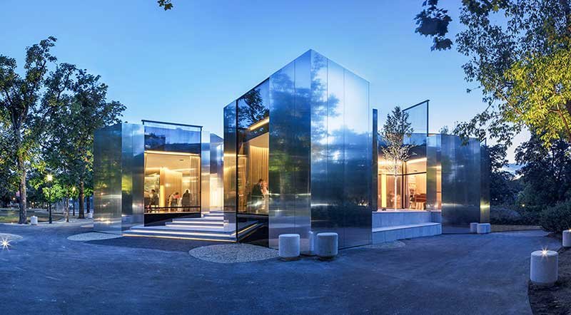
▲ Outside At Dawn

▲ Concept Model
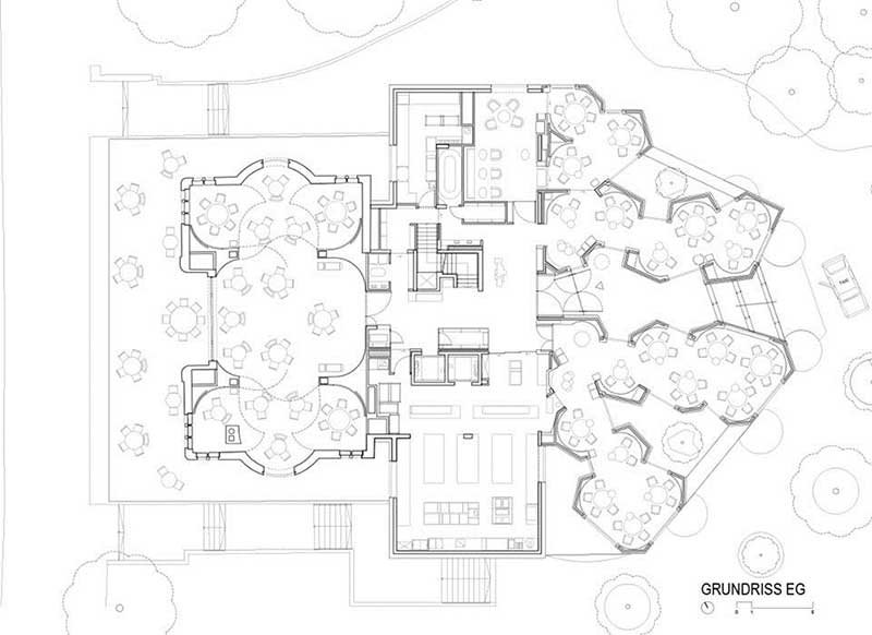
▲ Groundfloor Plan
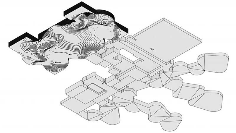
▲ Ceiling
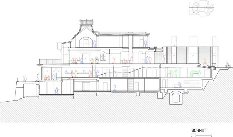
▲ Section
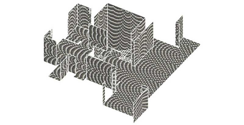
▲ Tiles Concept
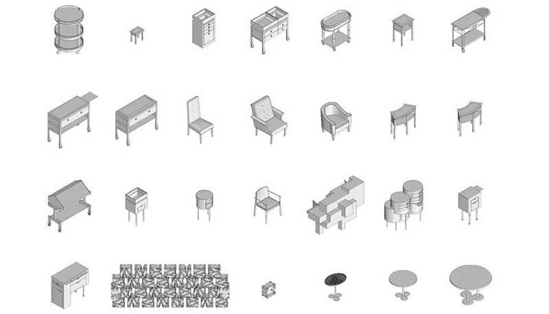
▲ Furnitures
