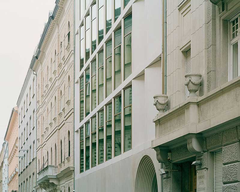
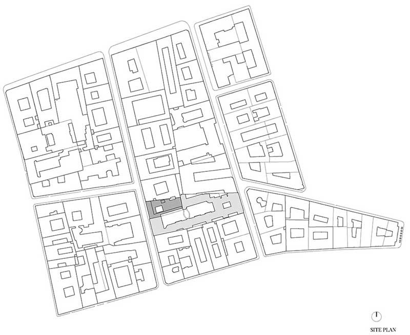
Semmelweis University is a leading institution of higher education in Hungary and the Central European region , encompassing medicine and health sciences. In 2016, the Faculty of Health Sciences held a design competition to extend a locally listed educational building from the early 1900s. The objective was to create seminar rooms, demonstration rooms, and 2 large lecture halls. The site is located between two streets in the “palace quarter” of Budapest. The neighborhood boasts palace-style maisons, important cultural and educational institutions constructed in the 19th and early 20th centuries.
▼ Overall Of The Project
Concept
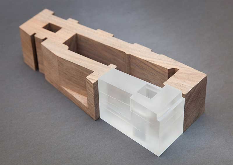
▼ Model
▼ Analysis Diagram
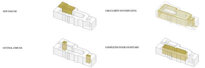
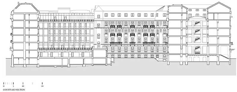
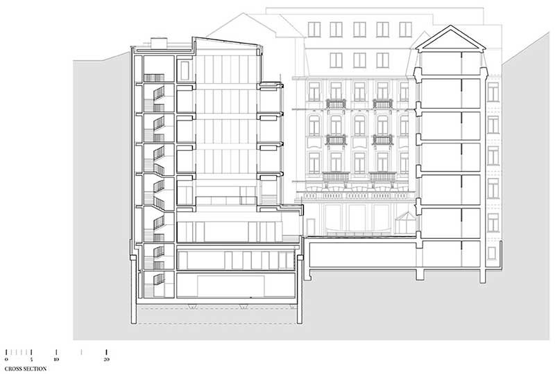
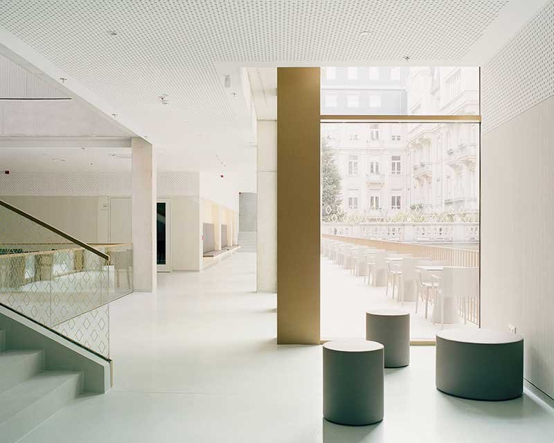
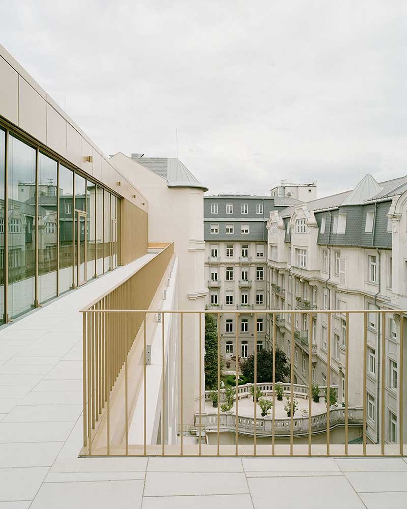
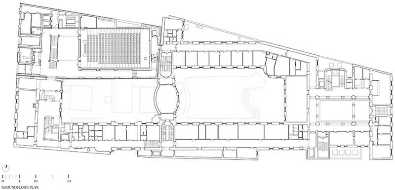
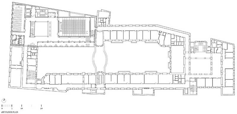
According to the main design concept, the new volume and the existing building form a cohesive complex. The basic design principles are based on dialogue with the existing building and have been derived from it. The addition creates a finished inner courtyard. The two buildings are connected on every level and the interior spaces are organized by a central atrium, which serves as the main spatial element of the new wing. The atrium is a modern replica of the old one. Community spaces surround the atrium , creating a visual connection to the inner courtyard on each level , creating an airy feeling inside.
▼ Atrium
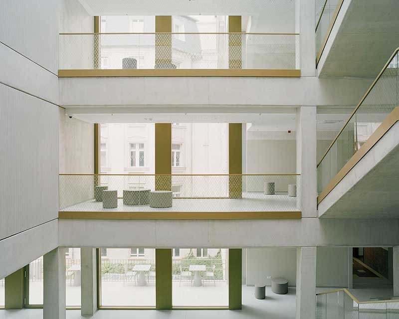
The atrium is decorated with stainless steel titanium metal plates, creating a modern and elegant atmosphere. The smooth, bright surface reflects its surroundings and glows in the sunlight. This design provides a stylish, high-end, and comfortable natural feeling.
These decorations can be combined with other elements, such as plants and lighting, to create a more warm and comfortable atmosphere. Keep in mind the simple and generous details and consider the actual needs and safety factors.
The use of stainless steel titanium plate decoration in an Atrium, metal screen partition decoration, will bring people pleasure and comfort, showcasing the modern architectural design field of attention to details and aesthetic pursuit of progress and breakthrough.
▼ Corridor And Terrace Around The Atrium
▼ Ceiling Of The Atrium

▼ Hallway

▼ Details Of Exterior And Interior
Facade
▼ Historical Photos
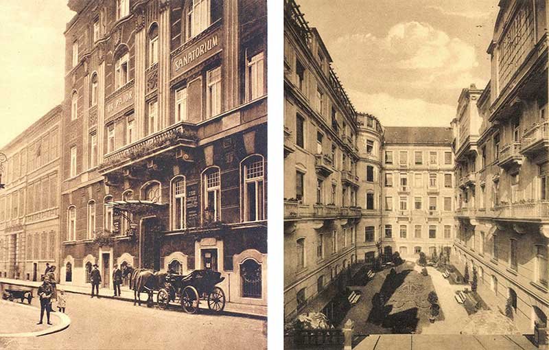
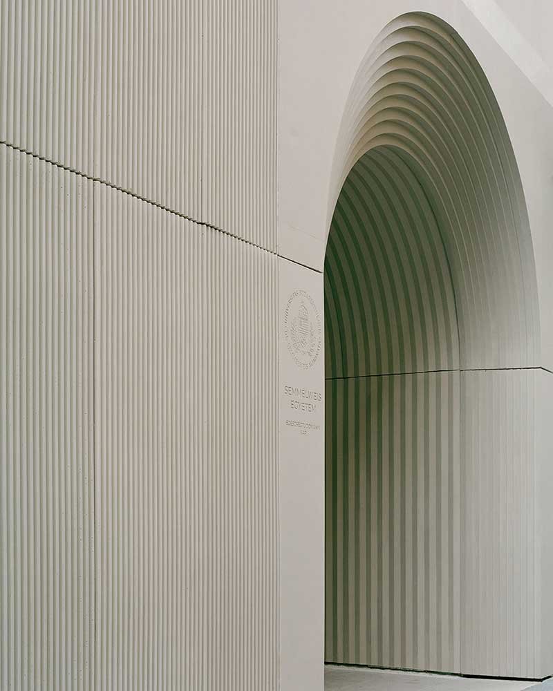
The building follows and captures the strong axiality and characteristic rhythm of the facades of the buildings in the neighbourhood. Due to the narrow street the main facade can be seen only by side. So the zig-zag geometry evokes the shadow effects of historic buildings and gives the building a two-faced appearance in the narrow street. The combination of smooth and textured precast concrete elements articulates the facade that colour matches to the existing building. On both the street and courtyard facade the grid is an abstraction which follows the building’s own structure and subtly responds to the existing building’s scheme.
▼ Courtyard
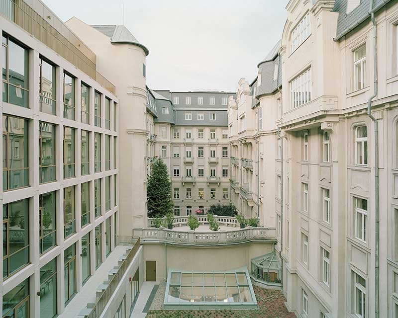
▼ Integration Of The Extension Part And The Original Building
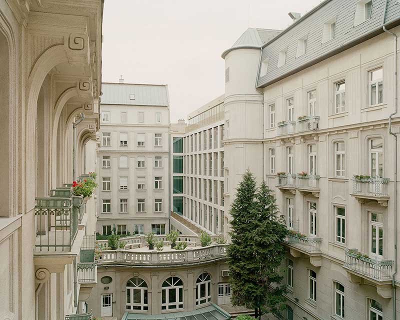
▼ Viewing The Courtyard From The Terrace
Interior
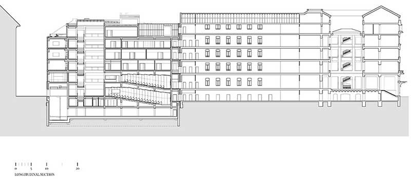
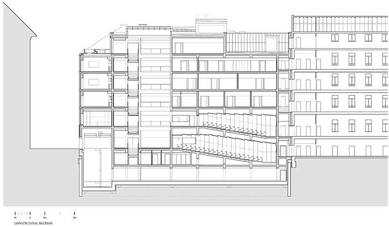
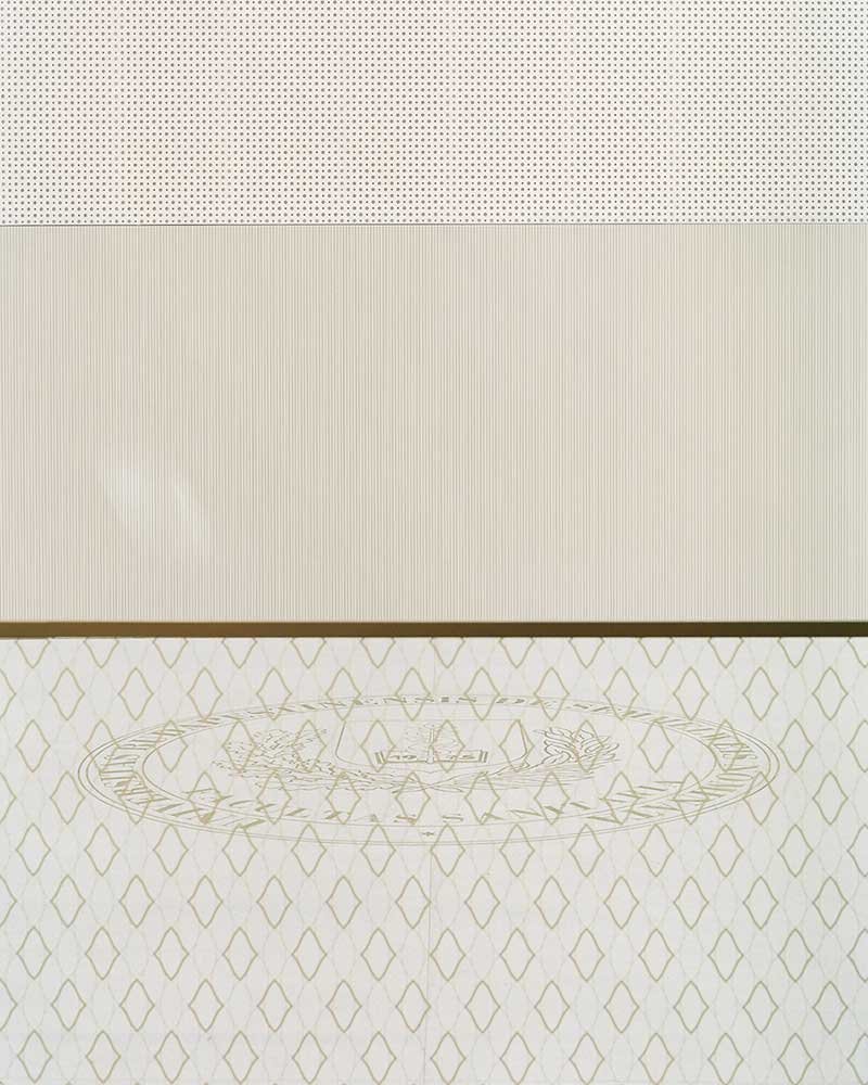
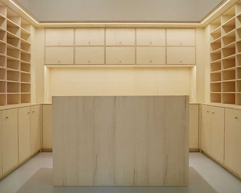
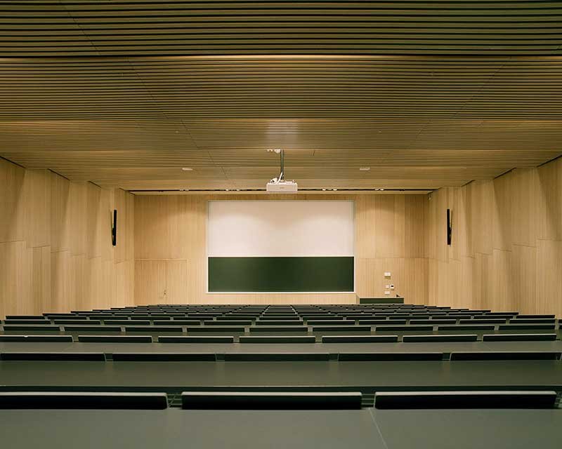
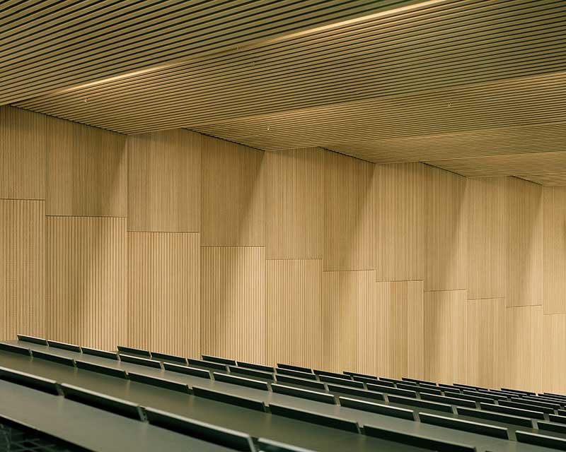
Light and neutral materials were used in the internal circulation spaces and communal spaces such as white terrazzo, in-situ concrete, structured wall panels and white perforated gypsum ceilings that give fresh and clean look to the spaces. In the lecture halls, refined acoustic panels with different patterns and oak finish increase the acoustic experience.
▼ Ground Floor Space
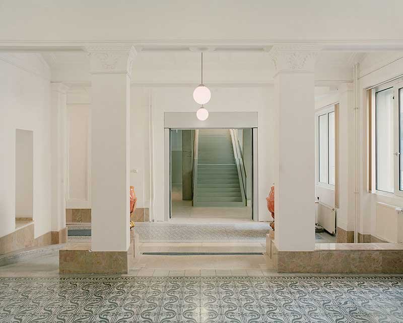
▼ Staircase
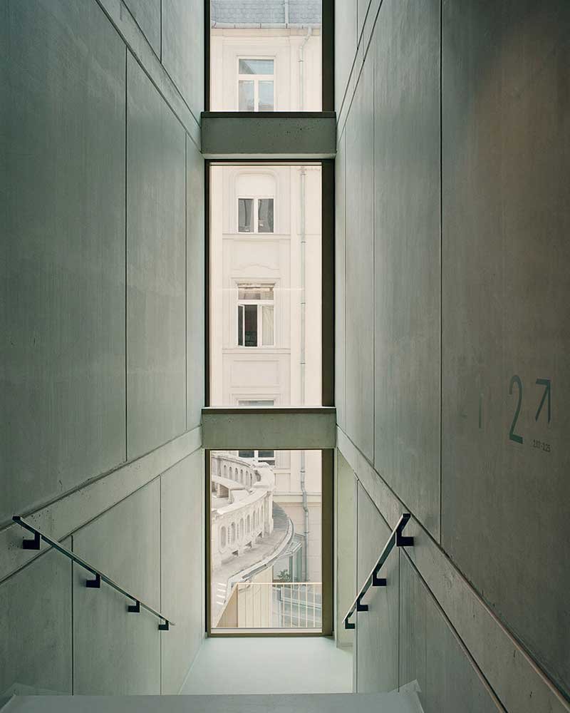
▼ Interior Circulation Space
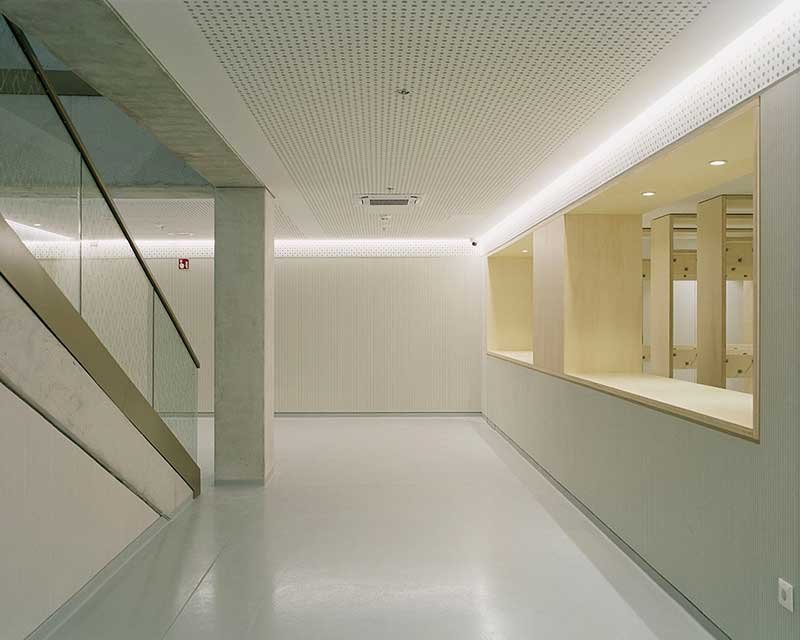
▼ Warm Timber Feature
▼ Iecture Hall
▼ Master Plan
▼ Ground Floor Plan
▼ First Floor Plan
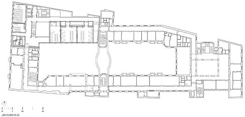
▼ Third Floor Plan
▼ Elevation

▼ Sections
